APOLO is a company that produces high quality clothing and uniforms. It is active in Bulgaria as well as in a number of other European countries – Austria, Denmark, Germany, France and others. APOLO always strives to be among the most innovative and high quality manufacturers. APOLO contacted us with a request to improve their corporate identity and to organize the brand architecture of the company.
The Result
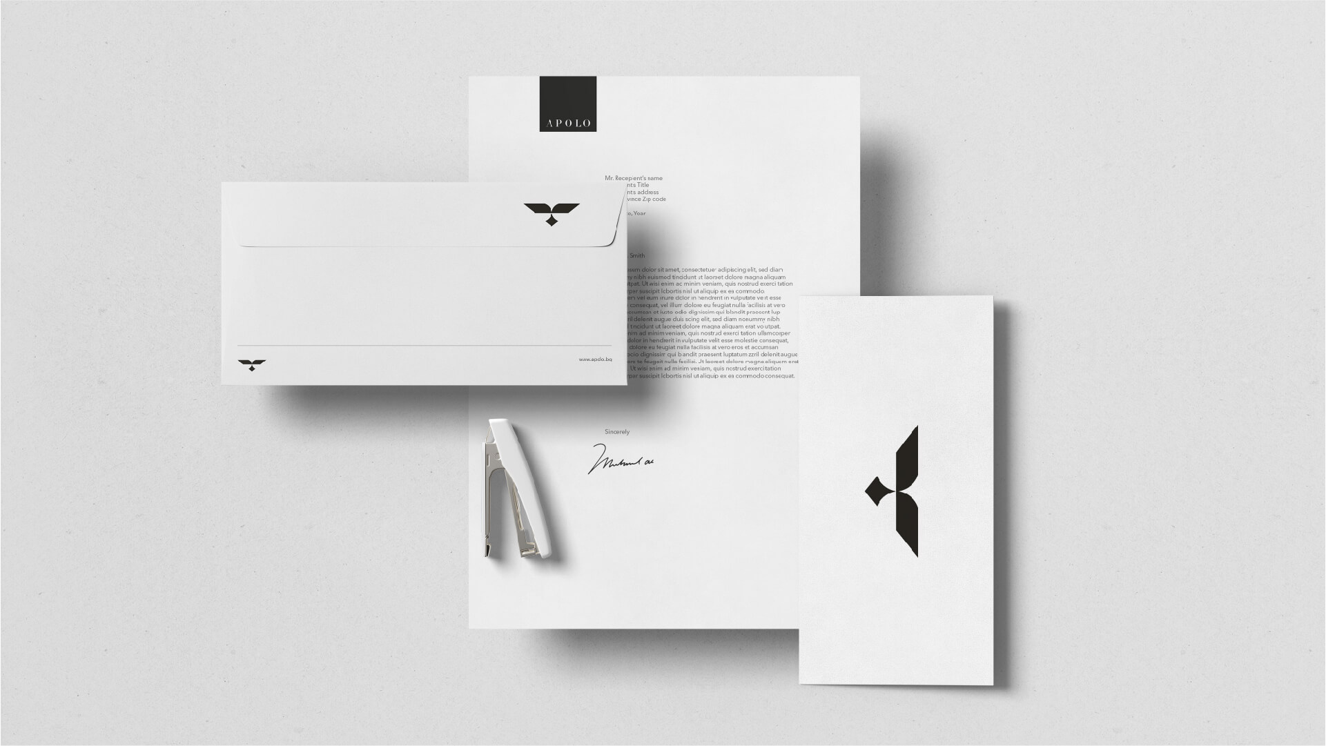
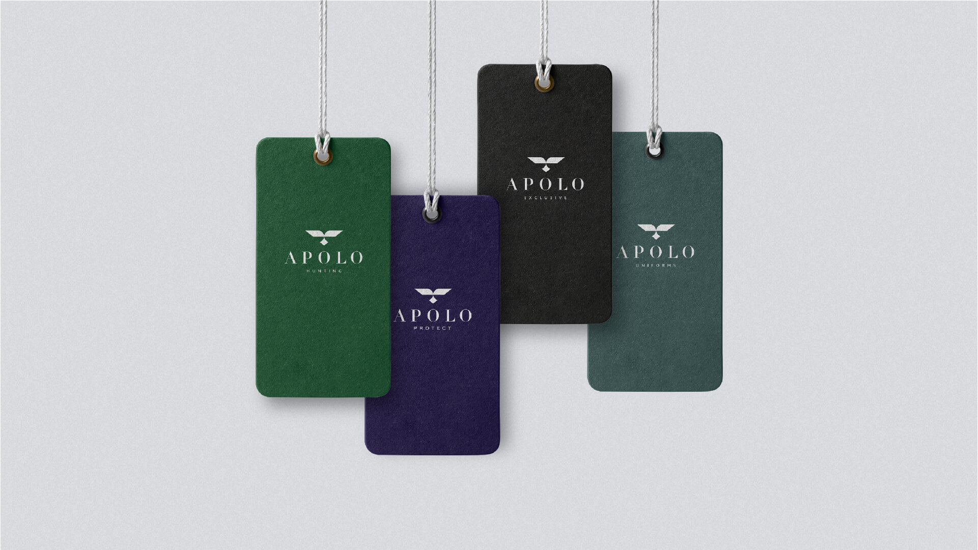
We have developed a corporate identity and a branding guideline that fully meets APOLO's high standards. We structured the brand architecture carefully and clearly.
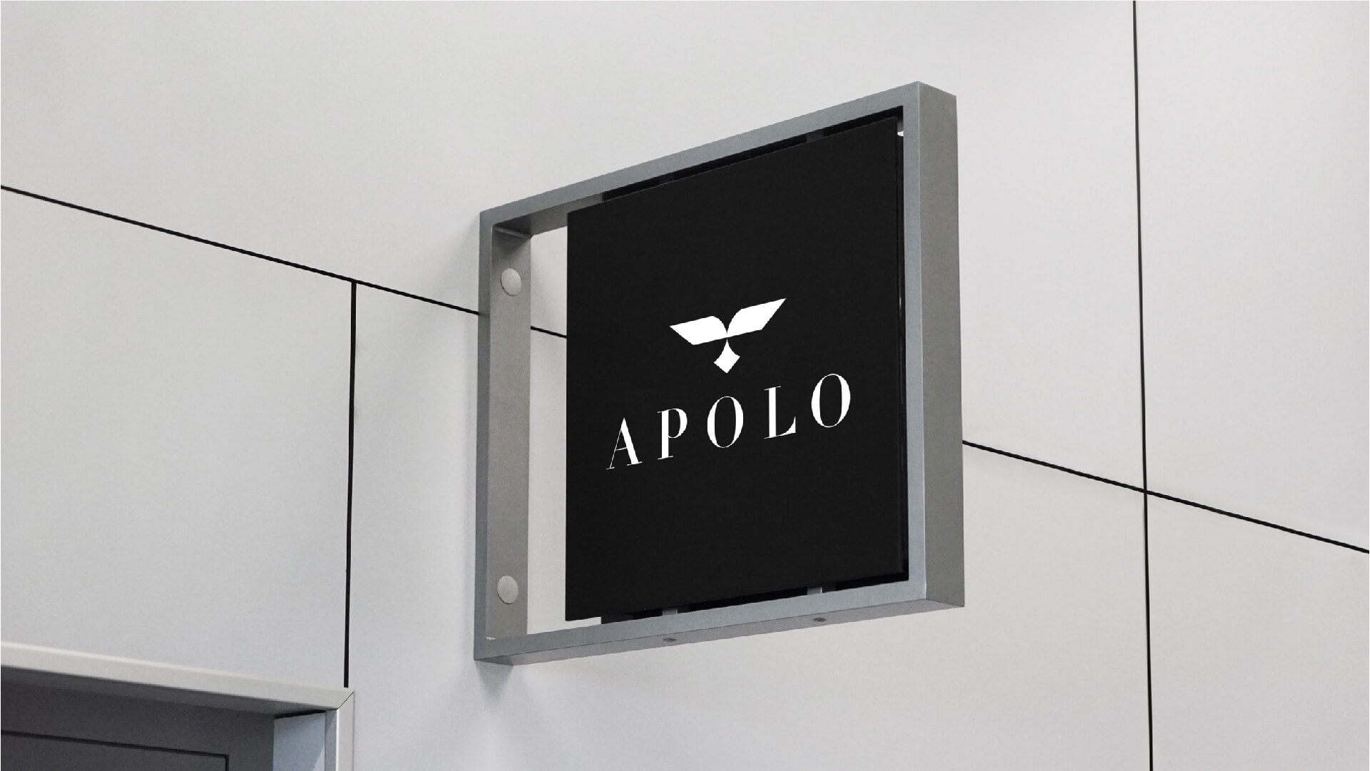
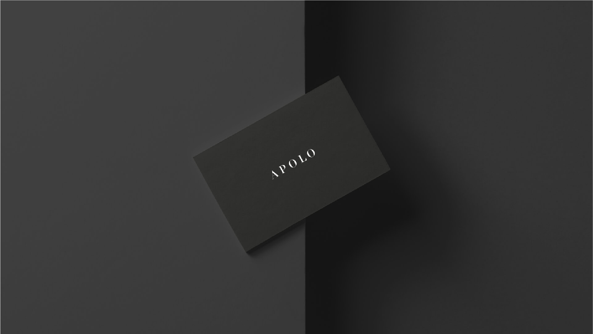
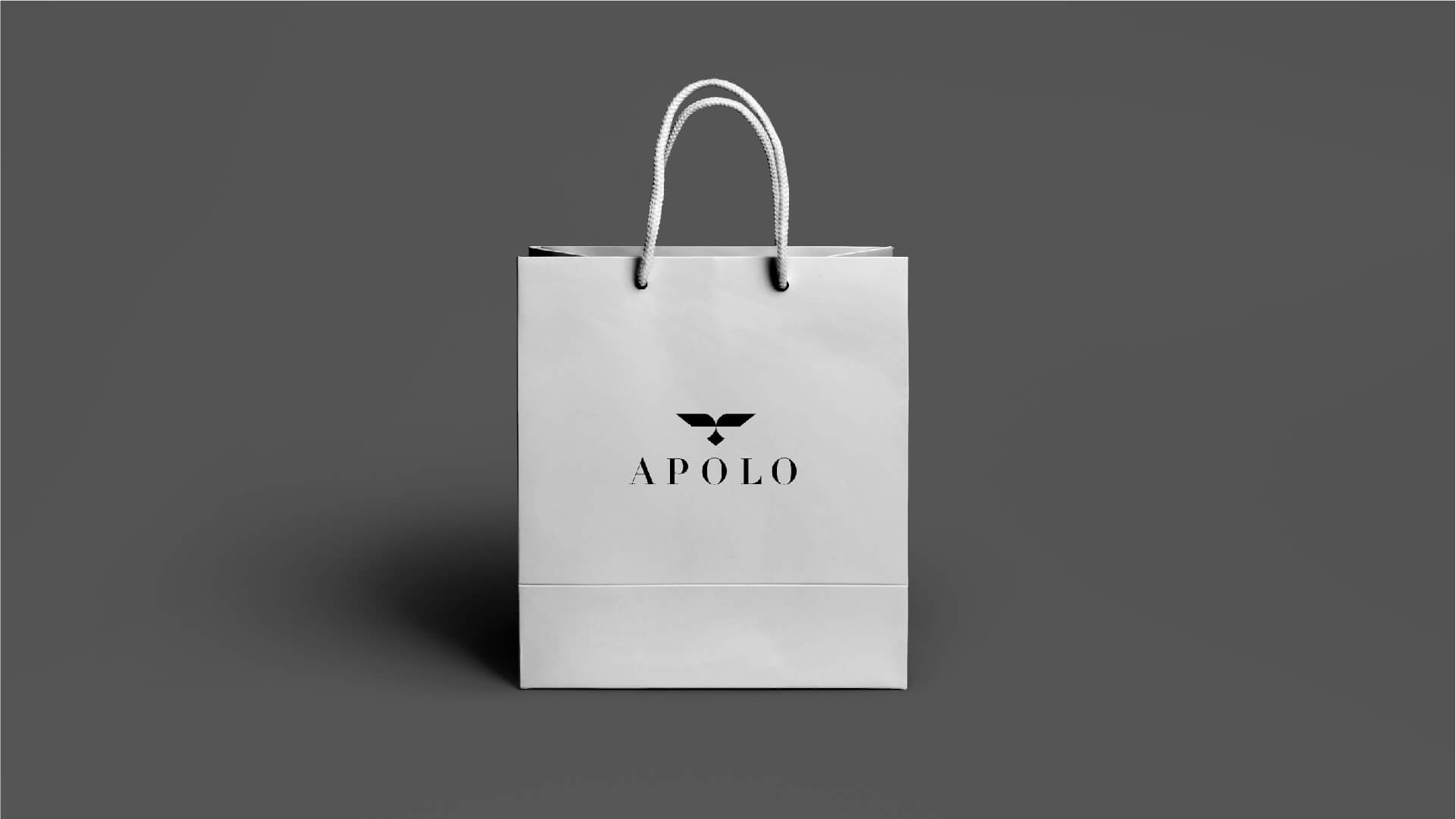
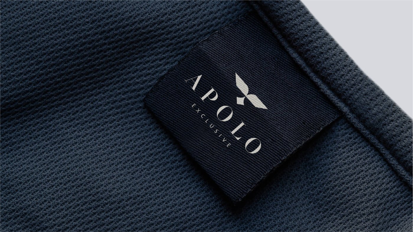
In the logo we kept the key symbol of APOLLO's identity - the eagle, but we simplified and stylized it. We complemented the vision with serif typography.
The new vision of the brand brings a sense of style and elegance.
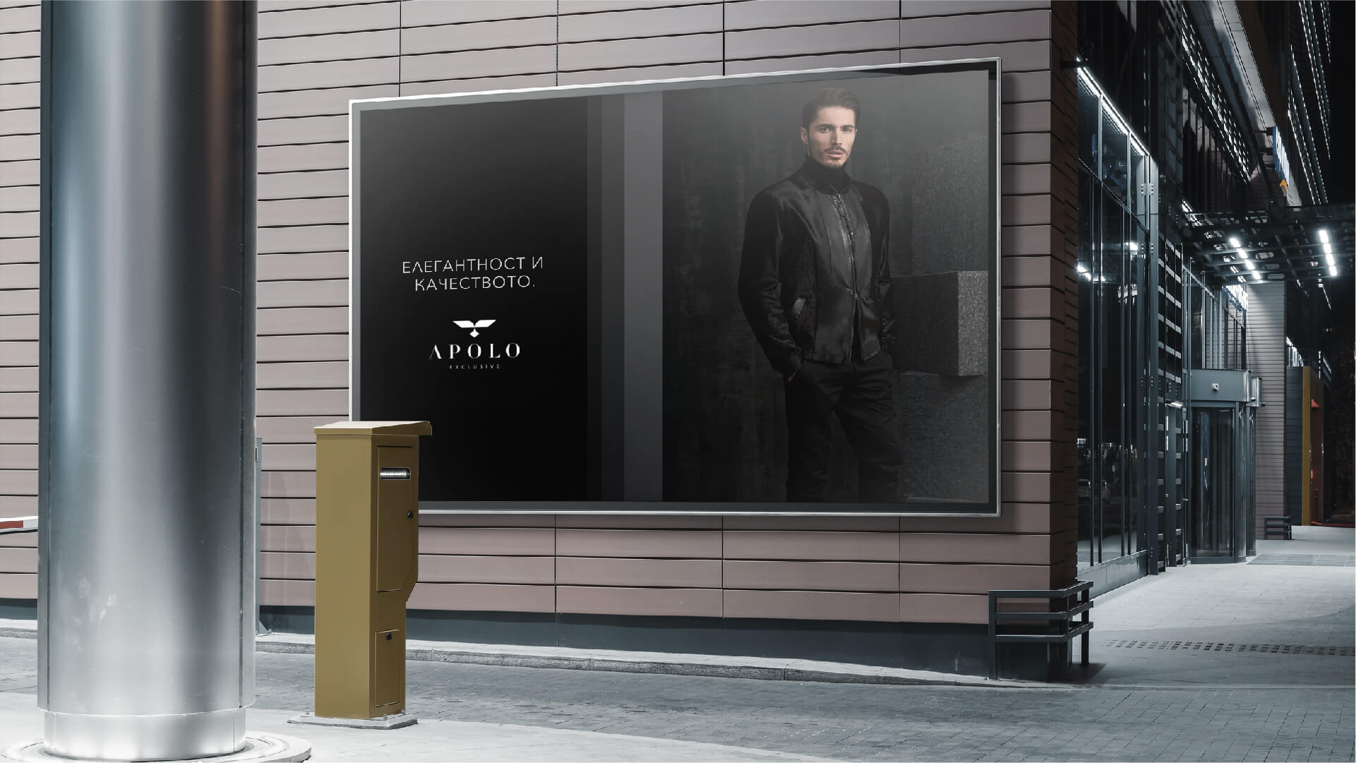
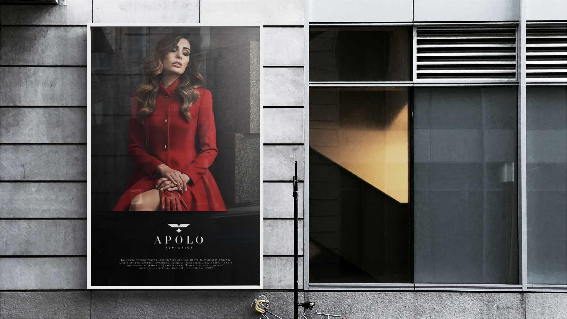
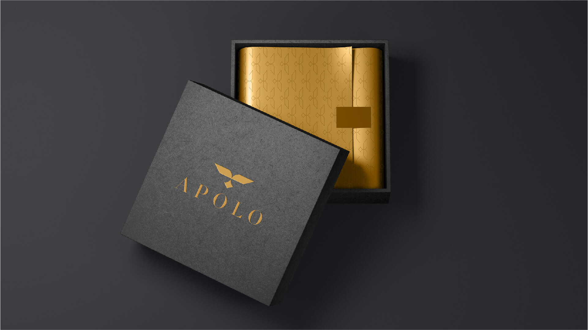
We implemented the identity in a series of materials.
Regardless of the environment in which the APOLO brand is presented, the materials convey the feeling of a premium brand.
Brand vision that fully reflects the quality of each of the products in the company's portfolio.
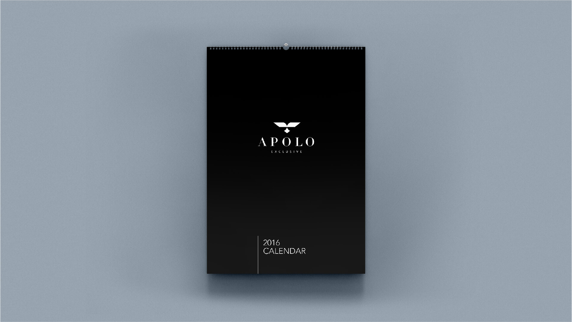
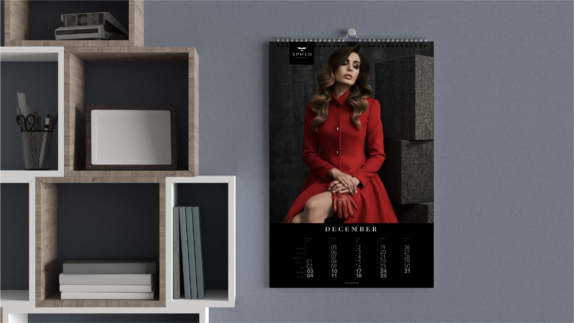
The client also trusted us to create a luxury calendar.
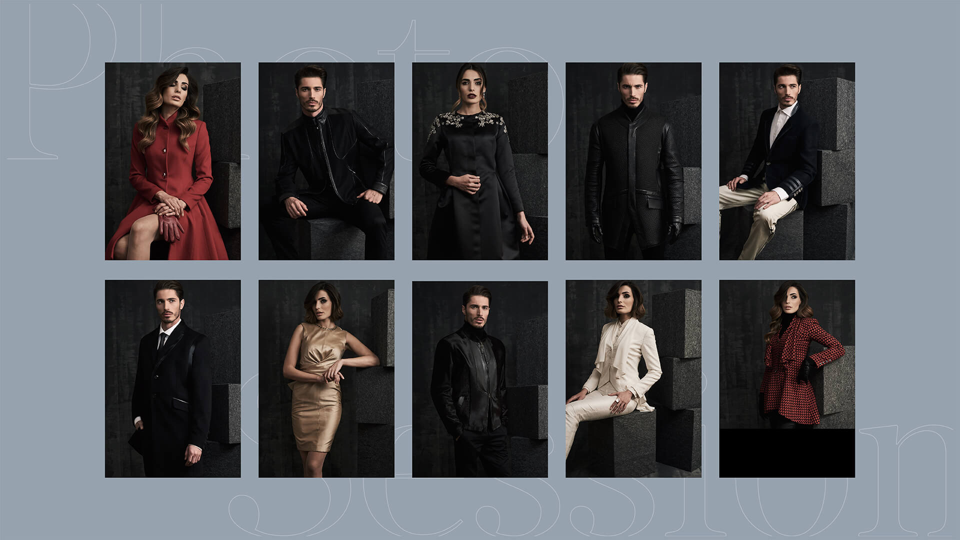
For this purpose, we organized a product photoshooting with a main focus on the extremely beautiful exclusive collection of APOLO.
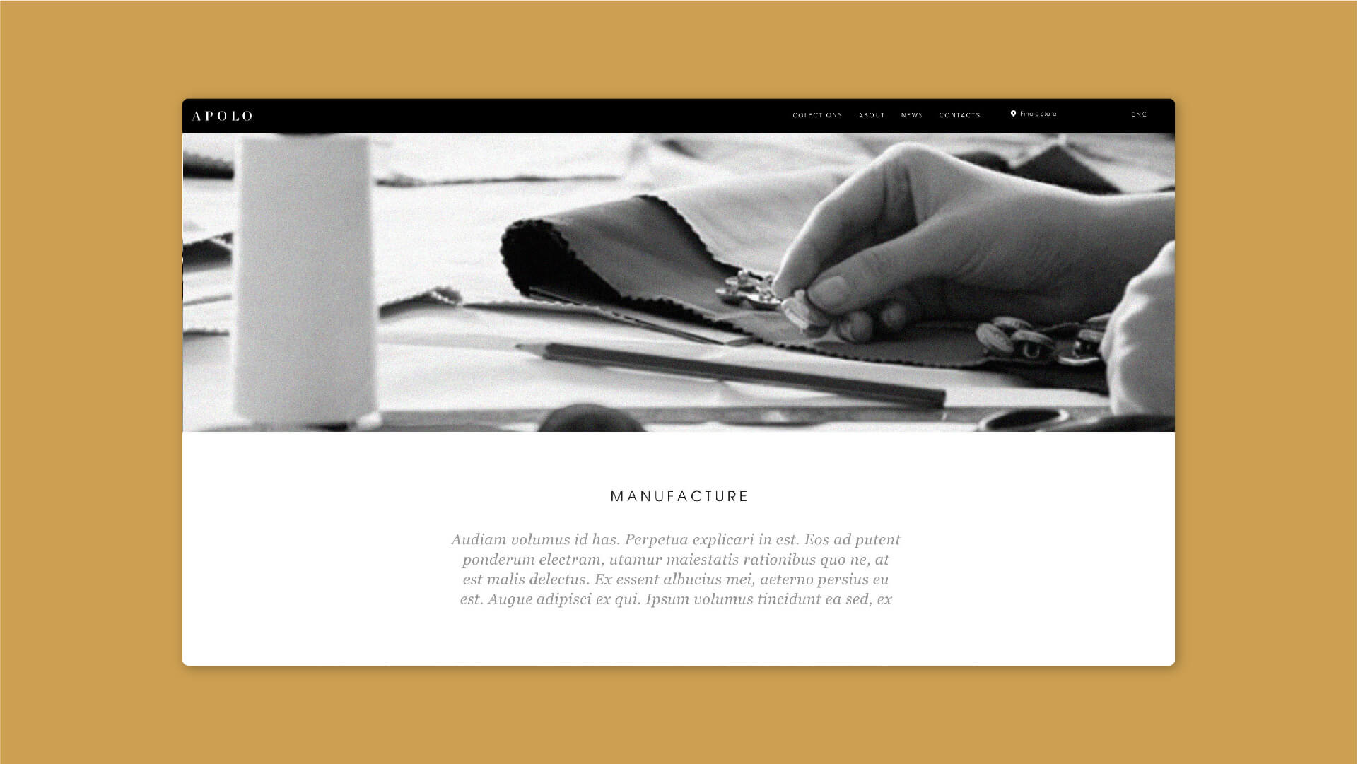
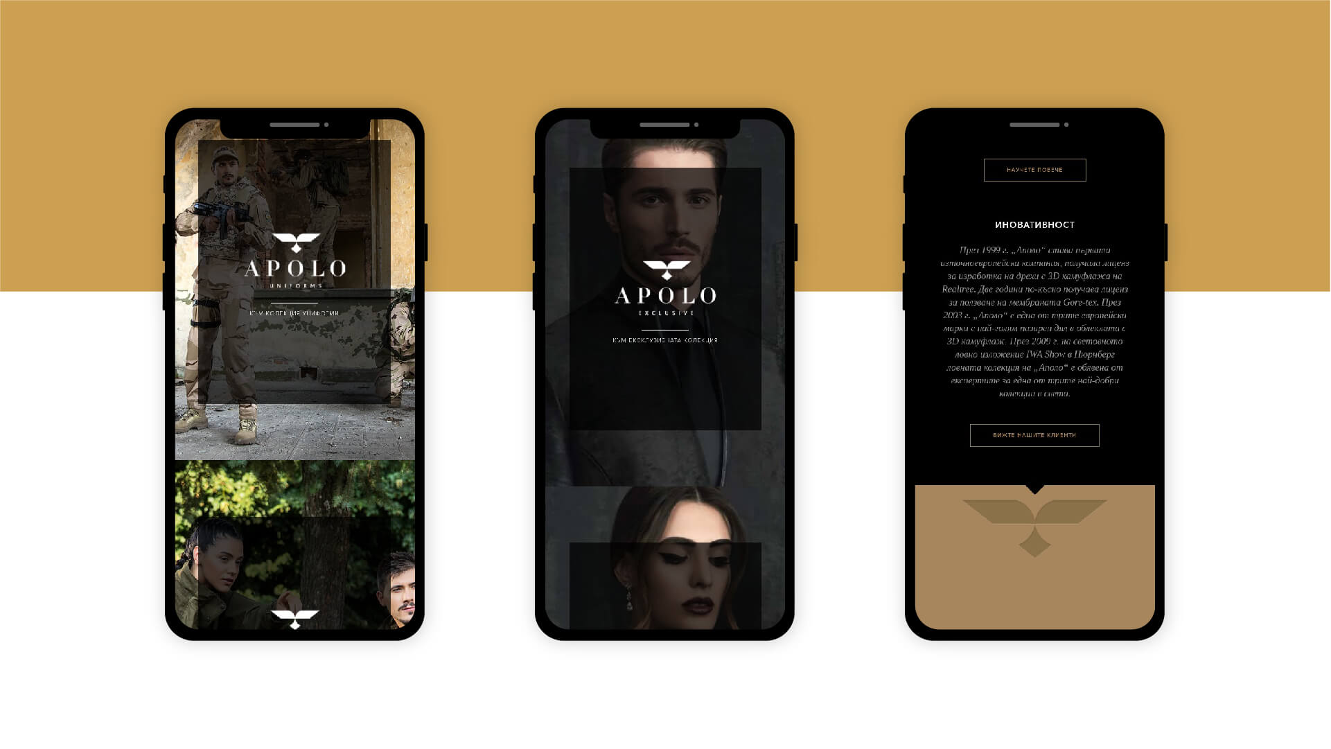
We have developed a website that presents the beautiful clothes and uniforms of APOLO. We created the design so that the large product images combined with sophisticated typography give a sense of style, sophistication and innovation.